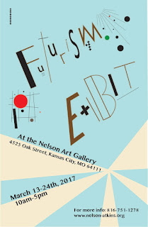
11x17 futurism poster
Earlier I did a powerpoint about the futurism movement. Since I learned a lot about Futurism, I chose it for the topic of my poster. For my research, I looked up "futurism graphic design" and I used ideas from those pieces into my poster. Then, we had to made 20 sketches for our poster. My ideas had a lot to do with the "rays" and having it focused in on one spot. Then, we had to find our best sketch and create it on illustrator. My idea was to have the "futurism exhibit" so be messy and not equal and not aligned right. On accident, I spelled "exhibit" wrong, oops. I also really liked to have the red and green color pop from the art because it gave the poster more character. This isn't my best work but I did enjoy made it.


Comments
Post a Comment